Most living rooms share a subtle proportional problem that goes unnoticed until a piece of art goes up. Standard 2.4-metre ceilings combined with long, low furniture, such as sofas, coffee tables, and media consoles, create a strong horizontal band across the room. The eye follows that line and stops. The ceiling reads as closer than it is, the wall feels emptier than it should, and the overall impression is one of compression rather than expanse.
The fix doesn’t require structural work. Vertical artwork, chosen at the right scale and placed with intention, changes how the eye reads a room’s geometry. It introduces a vertical sightline that counteracts horizontal dominance, making ceilings appear higher, and rooms feel more deliberate. This isn’t about decoration. It’s about using a single piece of art as an architectural correction that costs a fraction of a renovation.
Why Vertical Orientation Changes a Room’s Proportions
The human visual system tracks vertical lines differently from horizontal ones. When a room is dominated by horizontal planes, such as floor, ceiling, sofa line, and table edge, the brain registers width first and height second. Vertical elements interrupt that scan path and force the eye upward, creating the perception of height that exceeds the room’s actual dimensions.
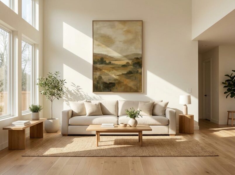
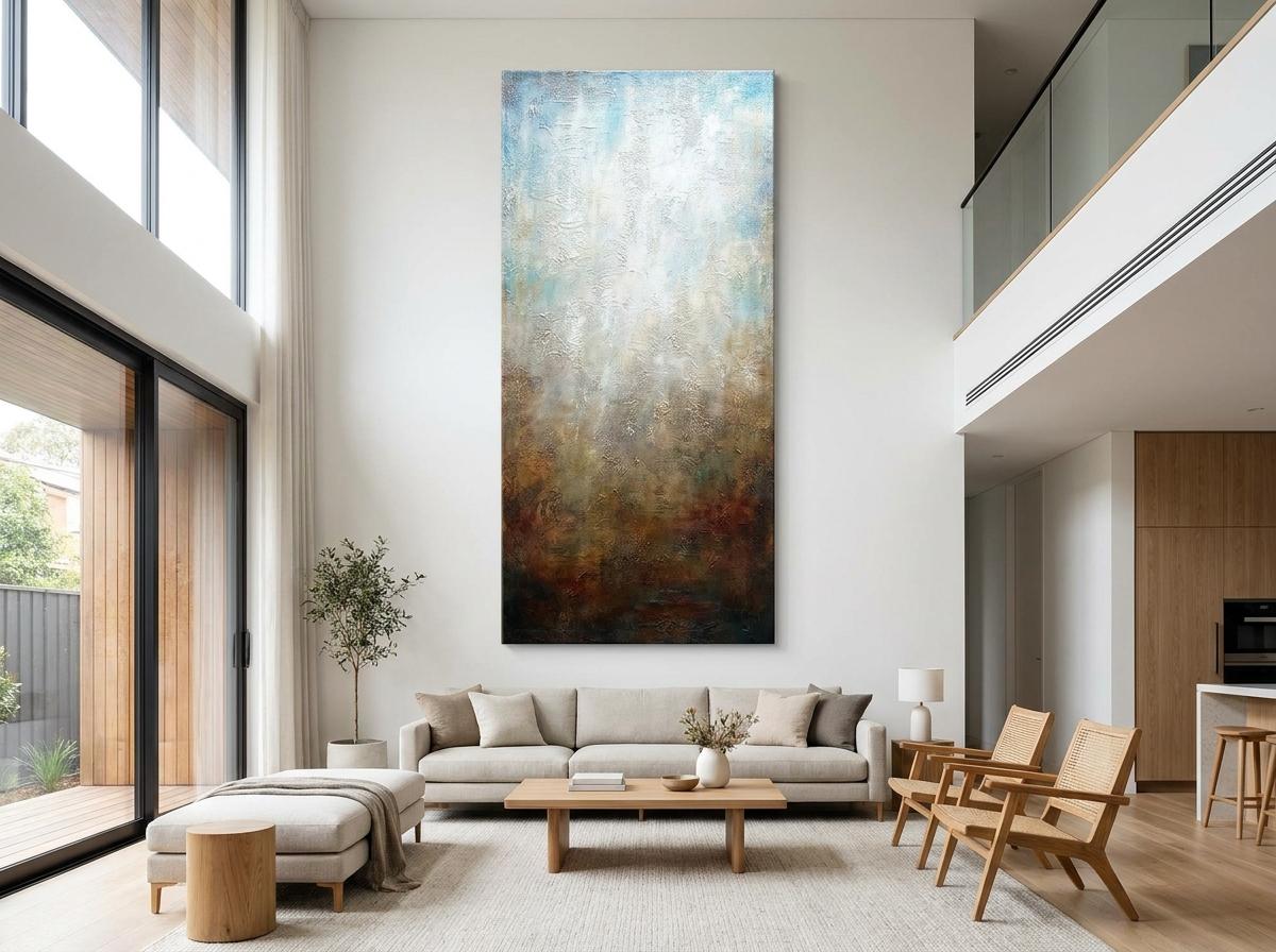
This principle is standard in commercial and hospitality design, where tall art and vertical panelling make narrow lobbies feel grand. In residential living rooms, the same logic applies. A single tall piece of vertical artwork for the living room above a sofa or console resets the room’s proportional balance. The piece doesn’t need to be massive. A canvas measuring 90 cm wide by 120 cm tall can transform a wall that a 120 cm by 90 cm horizontal piece would leave feeling flat.
Celebrity homes offer a useful reference. In open-plan living rooms featured in publications like Architectural Digest, designers consistently specify oversized vertical canvases above fireplaces and sofas. The strategy establishes a clear focal hierarchy in spaces lacking natural room divisions. That’s exactly the kind of spatial challenge most standard living rooms face.
What the Wall Art Market Tells Us About Consumer Priorities
Consumer spending patterns confirm what designers have long understood. The global wall art market was valued at $59.51 billion in 2025 and is projected to reach $63.67 billion in 2026, according to the Wall Art Market Report 2026 from The Business Research Company. Canvas format alone holds a 45.11 per cent share of that market, making it the dominant medium for residential art.
The scale of investment in living spaces supports this. A 2025 Houzz Renovation Trends Report found that 54 per cent of US homeowners undertook decorating projects in 2024, with the median living room update spending at $4,000. Online art sales accounted for 18 per cent of the total art market in 2024, totalling $10.5 billion, per the Art Basel and UBS Global Art Market Report 2025.
These figures point to a clear shift away from filler pieces bought to cover empty wall space and toward intentional, architecturally scaled art. Consumers are spending more per piece, researching proportions before buying, and treating wall art as a permanent fixture rather than a temporary accessory. Vertical pieces benefit directly from this trend because they deliver maximum visual impact in a footprint that suits modern living room dimensions.
The Rules of Scale and Placement for Vertical Art
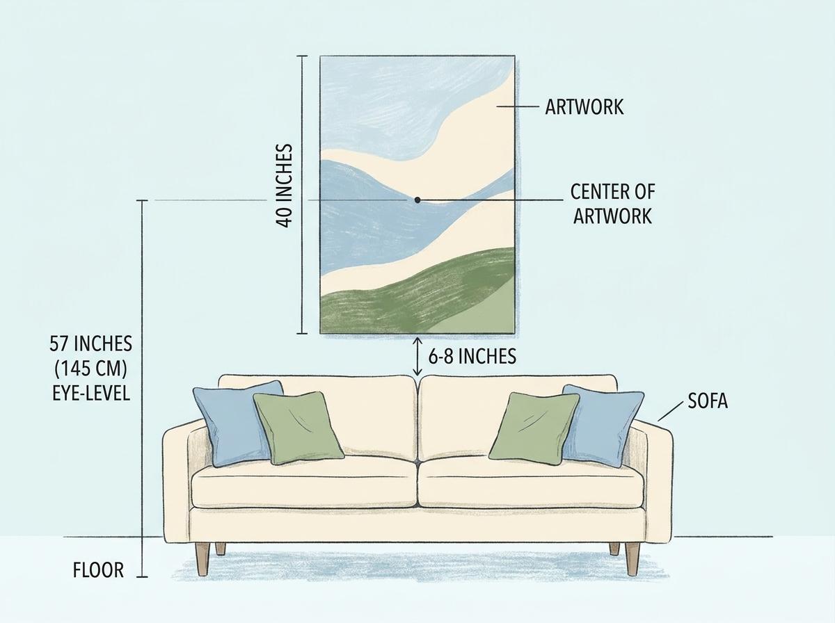
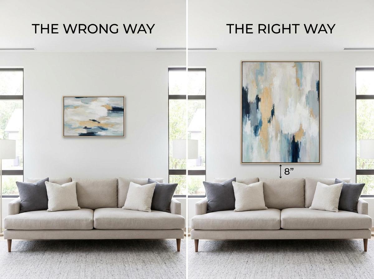
Getting vertical art right comes down to three measurements. The first is the museum standard: the centre of the artwork should be 145 cm (57 inches) above the floor. This places the piece at average human eye level and creates a consistent reference point across the room.
The second is the furniture-width rule used in professional staging. A vertical piece above a sofa or console should cover 60 to 75 per cent of the furniture’s width. For a 240 cm sofa, the art should measure between 144 cm and 180 cm wide. The height-to-width ratio matters more for vertical pieces than horizontal ones, so aim for a 3:4 or 1:1.6 proportion to maintain the elongating effect.
The third measurement is clearance. The bottom edge of the art should sit 15 to 30 cm (6 to 12 inches) above the back of the sofa or the top of the console. Less than 15 cm, and the piece feels crowded. More than 30 cm, and the visual connection between the furniture and the art breaks down.
For rooms with ceilings under 2.4 metres, pull the art slightly lower, centring it at 137 cm instead of 145 cm, to keep the vertical line within the comfortable viewing range. For ceilings above 3 metres, the 145 cm rule still applies, though you have room for taller pieces that fill more of the vertical plane. Industry guides such as this resource from Fine Art Shippers on choosing the perfect wall art size confirm these standards as the professional baseline.
A practical test: cut craft paper to the dimensions of your proposed piece, tape it to the wall at the correct height, and live with it for 24 hours. If it feels too large, go larger. Most homeowners undershoot on scale.
Choosing a Vertical Piece That Works With Your Living Room’s Architecture
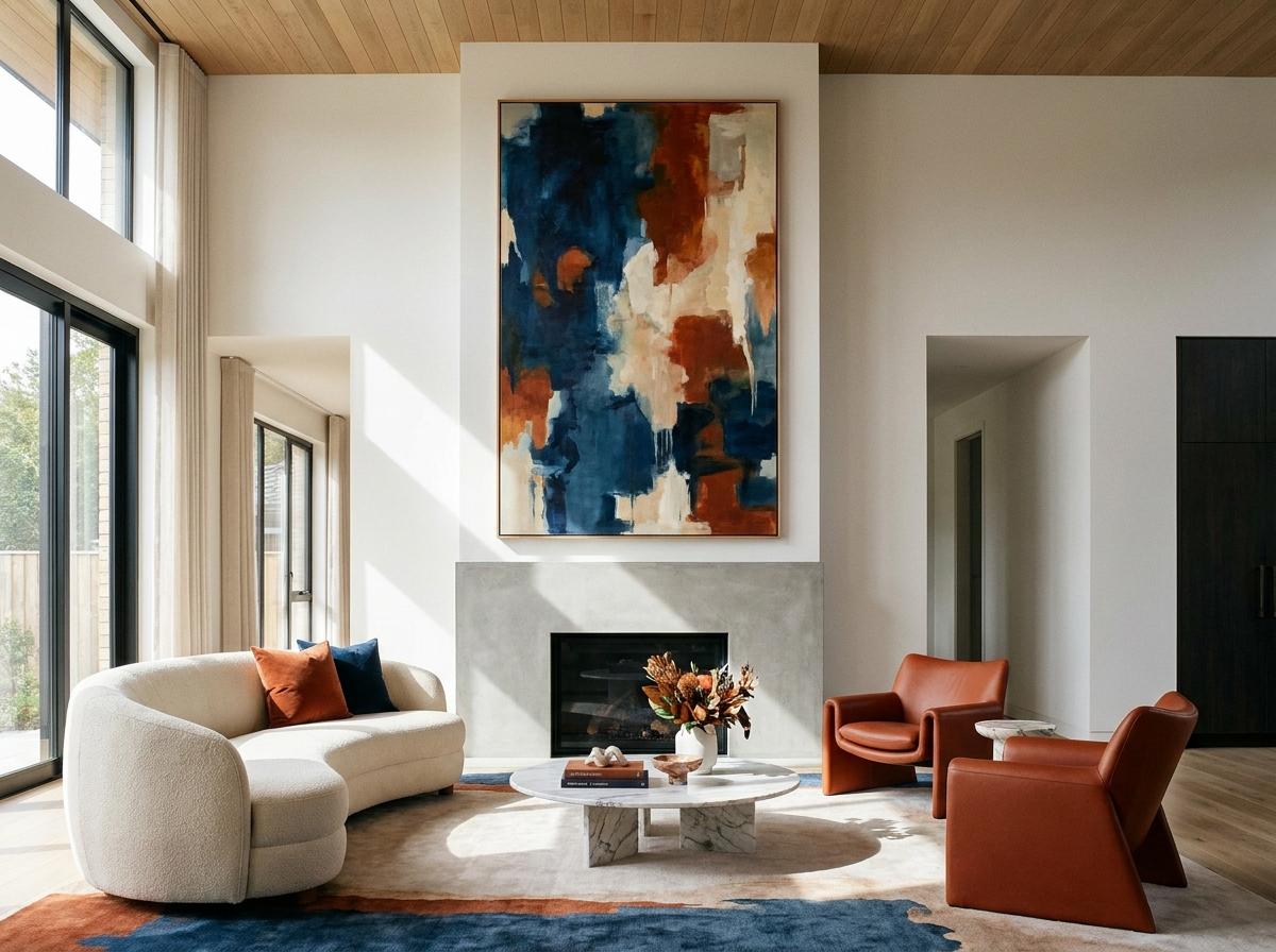
The wall itself dictates the art. A tall, narrow wall between two windows calls for a single vertical canvas that mirrors the proportions of the space between them. A wide wall above a long sofa can handle a vertical triptych of three tall panels spaced evenly, or a gallery column of smaller framed works stacked vertically.
Colour plays a structural role in how the piece reads spatially. Cool tones in the blue-green spectrum recede visually, which amplifies the elongating effect of a vertical canvas. Warm tones advance, making the piece feel closer and weightier. For a room that already feels narrow, a cool-toned vertical canvas enhances the sense of depth. For a room that feels too wide, a warm-toned piece adds visual weight that balances the proportions.
Texture functions as a substitute for surface area. A heavily textured canvas or layered mixed-media piece reads as larger than a flat print of the same dimensions. This matters when budget or wall constraints rule out a truly oversized canvas. Frame choice reinforces orientation as well. A slim metal frame continues the vertical line uninterrupted, while a wide, ornate frame adds traditional weight but shortens the perceived height.
What celebrity interiors reveal about these decisions is instructive. As covered in NylaHome’s analysis of modern interior design priorities in celebrity homes, designers select art that reinforces architectural lines rather than contradicting them. A vertical piece that echoes a window mullion or a wall panel creates a cohesive visual system rather than a random accent.
Common Mistakes and How to Avoid Them
Even with the right piece, installation errors undo the effect. The most frequent mistake designers report is hanging art too high. The instinct to centre a piece on the wall rather than over furniture results in art that floats, disconnected from the room’s functional zones. The fix is simple: ignore the wall centre and align to furniture and eye level.
The second mistake is choosing art that is too small. The 60-75 per cent rule solves this every time. Measure the furniture width before shopping, not after. A piece covering less than half the sofa’s width looks like a postage stamp regardless of its orientation.
Lighting is the variable that professionals consistently address, and homeowners often overlook. Vertical art needs accent lighting to perform its spatial role. The standard specification is 30 to 50 foot-candles of ambient light with 90 to 150 foot-candles of accent light directed at the piece. Colour temperature should be 2700 to 3000 K. This is warm enough to feel residential yet neutral enough not to distort the art. Avoid recessed ceiling fixtures that cast downward shadows across tall pieces. Choose a picture light mounted above the canvas or adjustable track heads aimed at a 30-degree angle instead.
For renters or anyone avoiding wall damage, a vertical gallery column of several smaller framed pieces stacked with consistent spacing delivers the same elongating effect without a single large anchor point. It also allows flexibility as your collection grows, a principle that echoes NylaHome’s guide to home design adjustments for functionality, where adaptable layouts take priority over fixed installations.
Vertical Art as a Spatial Strategy
Vertical artwork isn’t a trend that cycles out with next season’s colour palette. It’s a repeatable spatial tool that corrects fundamental proportion problems in standard residential living rooms. When chosen at the right scale, covering 60 to 75 per cent of furniture width, centred at 145 cm, with 15 to 30 cm of clearance, a single tall piece redefines how a room feels without changing its dimensions.
The investment returns more than decoration. It returns better proportions, a clearer focal hierarchy, and a room that reads as professionally designed. Measure the wall. Measure the furniture. Go bigger than instinct suggests. That single shift separates a room that feels finished from one that feels merely filled in.